12 min read
How to Read Candlestick Charts: A Beginner's Guide
Each candle shows four prices for one period of time. Here is how to read them, what the popular patterns really tell you, and where beginners go wrong.
In this guide
- 01The anatomy of a single candle
- 02Timeframes: the same market, different candles
- 03Well-known candlestick patterns (and how much to trust them)
- 04Adding volume to the picture
- 05Reading a chart, not just a candle
- 06Common mistakes when reading candlestick charts
- 07Candlesticks in crypto versus forex
- 08A simple practice routine
- 09Key takeaways
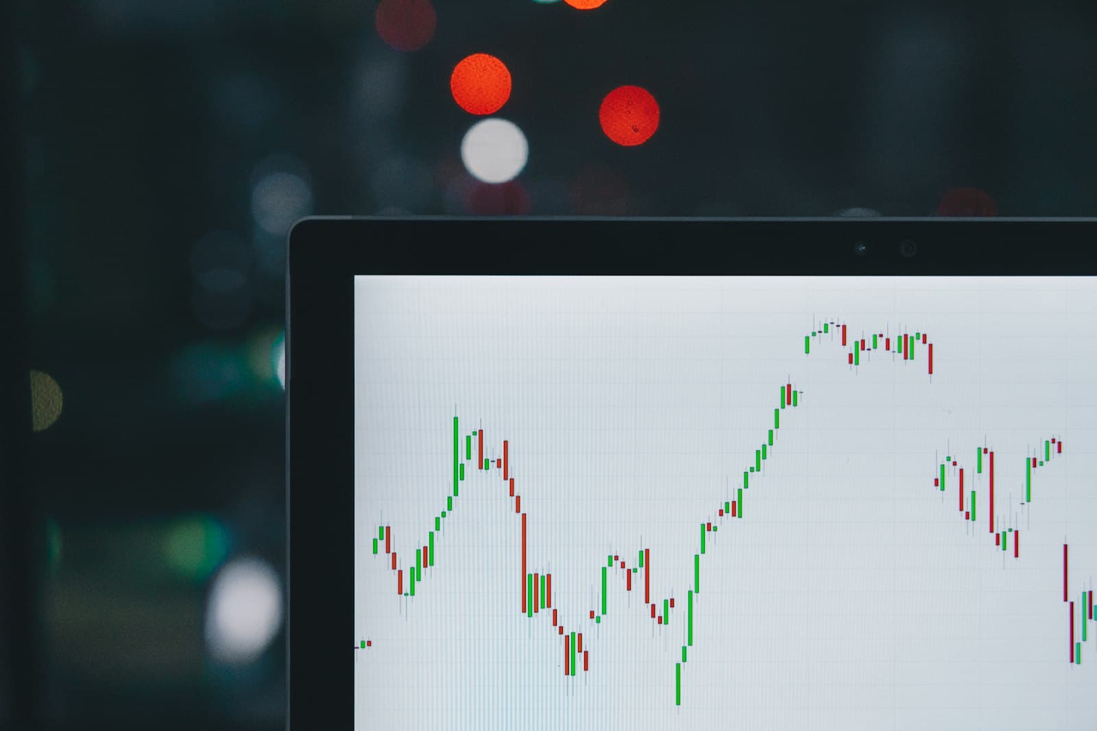
A candlestick chart shows how price moved during each period of time, one candle per period. Every candle packs four numbers into one shape: the open, the high, the low and the close. The thick part (the body) spans the open and close, the thin lines (the wicks) reach out to the high and low, and the color tells you whether price finished higher or lower than it started.
This guide walks through the anatomy of a candle, how timeframes change what you see, a handful of well-known patterns, and how volume fits in. It is education, not financial advice. Reading charts well does not make trading safe: prices can move against you for reasons no chart shows, and trading always carries a real risk of losing money.
The anatomy of a single candle
Pick any candle on a chart and it represents one fixed slice of time, such as one minute, one hour or one day. During that slice, the market traded at many prices. The candle keeps only four of them:
- Open: the first traded price of the period.
- High: the highest price reached during the period.
- Low: the lowest price reached during the period.
- Close: the last traded price of the period (or the latest price, if the period is still in progress).
That is why traders often call this OHLC data. A bar chart shows the same four numbers with small ticks instead of a body, and a line chart usually connects only the closes. Candlesticks became popular because the shape makes the relationship between the open and close easy to see at a glance.
Bodies: the distance between open and close
The body is the rectangle between the open and the close. If the close is above the open, the candle is bullish for that period and is usually drawn green (or hollow on some older charts). If the close is below the open, it is bearish and usually drawn red (or filled). Colors are a setting, not a rule, so check your chart's legend before assuming anything.
Here is a simple example. Suppose a stock opens at $100, trades up to $106, dips to $98 and closes at $104. The body runs from $100 to $104, so it is $4 tall and green. The upper wick runs from $104 to $106 ($2), and the lower wick runs from $100 down to $98 ($2). In one shape you can see that buyers pushed price up, sellers pushed it back from the highs, and the period still finished $4 higher than it started.
Wicks: where price went but did not stay
Wicks (also called shadows or tails) show the price range that was visited but not held by the close. A long upper wick means price traded well above the close at some point, then fell back. A long lower wick means price traded well below the close, then recovered. Wicks are useful context because they show rejected prices, but they do not tell you the order of events inside the candle. A candle with long wicks on both ends could have gone up first or down first. If you need that detail, drop to a lower timeframe.
Body size and what it suggests
A tall body with short wicks means price moved decisively in one direction and closed near the extreme. A small body with long wicks means price moved around a lot but ended close to where it began, which traders read as indecision or balance between buyers and sellers. Size is relative: a $2 body is huge on a quiet stock and tiny on a volatile one, so always compare a candle to the ones around it.
Timeframes: the same market, different candles
Every candle has a timeframe, and changing it changes the picture completely. A daily chart of Bitcoin might show a calm uptrend while the 5-minute chart of the same day looks like chaos. Neither is wrong. They are different zoom levels on the same data.
Higher-timeframe candles are built from lower-timeframe ones. Four 1-hour candles combine into one 4-hour candle like this: the open is the open of the first hour, the close is the close of the last hour, the high is the highest high of the four, and the low is the lowest low of the four. Understanding this helps you avoid a common trap, which is treating a pattern on a 1-minute chart as though it carries the same weight as one on a daily chart.
- 1-minute to 15-minute: very noisy, heavily affected by the spread and short bursts of orders. Used mostly by active day traders.
- 1-hour to 4-hour: a middle ground that many swing traders use to time entries.
- Daily: the most widely watched timeframe. Levels that matter on a daily chart are seen by many participants.
- Weekly and monthly: useful for the big picture and long-term trend, too slow for timing most trades.
A practical habit is to start on a higher timeframe to understand the trend and major price levels, then move down one or two steps to look at detail. If the daily chart shows a strong downtrend, a bullish-looking candle on the 15-minute chart is a small event inside a bigger move.
Well-known candlestick patterns (and how much to trust them)
Candlestick patterns are named shapes made of one to three candles. Traders use them to describe what happened and to form a hypothesis about what might happen next. The honest summary is this: patterns describe the recent balance between buyers and sellers, but on their own they are weak predictors. Research on candlestick patterns has produced mixed results, and many patterns perform little better than chance once trading costs are included. They work best as one piece of evidence within a larger plan, not as signals to act on automatically.
With that caveat, here are the patterns you will see mentioned most often.
Doji
A doji is a candle where the open and close are equal or nearly equal, so the body is a thin line. The wicks can be long or short. A doji says that, by the end of the period, neither side won. After a long run up or down, a doji can hint that momentum is fading. In a sideways market, dojis are everywhere and mean very little. Variations include the long-legged doji (long wicks on both sides), the dragonfly doji (long lower wick, close near the high) and the gravestone doji (long upper wick, close near the low).
Hammer and shooting star
A hammer has a small body near the top of the candle and a lower wick at least about twice the body's length, with little or no upper wick. It shows that sellers pushed price well down during the period, but buyers brought it back up by the close. A hammer is usually discussed when it appears after a decline, where it may suggest selling pressure is being absorbed.
The shooting star is the mirror image: a small body near the bottom and a long upper wick, appearing after a rise. Buyers pushed price up, then sellers took it back. The same shape in the wrong context has different names (a hanging man looks like a hammer but appears after a rise; an inverted hammer looks like a shooting star but appears after a fall), which tells you how much of the meaning comes from context rather than from the candle itself.
Bullish and bearish engulfing
An engulfing pattern uses two candles. In a bullish engulfing, a red candle is followed by a green candle whose body completely covers the prior red body. In a bearish engulfing, a green candle is followed by a larger red candle whose body covers it. The idea is that one side took control decisively in the second period. Some traders only count engulfing patterns that form near an important price level or after an extended move, which filters out many of the weak ones.
Morning star and evening star
These are three-candle patterns. A morning star is a strong red candle, then a small-bodied candle (often a doji), then a strong green candle that closes well into the first candle's body. It describes a decline losing steam and buyers stepping in. The evening star is the reverse at the top of a rise. Because they need three specific candles, they appear less often than single-candle patterns.
How to treat any pattern
- Check the context first. Is the pattern at a level that matters, such as a prior high or low, or in the middle of nowhere?
- Check the timeframe. A pattern on a daily chart reflects far more trading than one on a 1-minute chart.
- Wait for the candle to close. A hammer halfway through its period can turn into a completely different candle by the close.
- Look for confirmation. Many traders want the next candle to move in the expected direction before acting.
- Plan the exit before the entry. Decide where you are wrong and how much you will risk. Our guides on stop-loss orders and position sizing cover that part in detail.
Adding volume to the picture
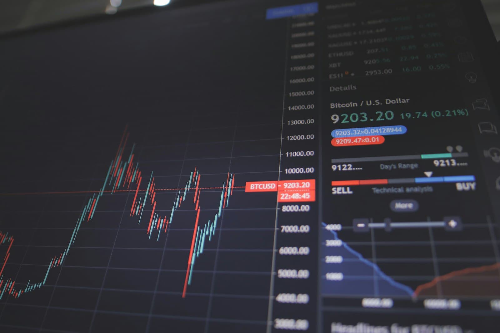
Volume is the amount traded during each candle's period, usually shown as bars beneath the chart. It adds a dimension that price alone cannot: how much participation stood behind a move.
A breakout above a prior high on volume well above average suggests many participants were involved. The same breakout on thin volume is easier to reverse. Likewise, a hammer at a support level carries more weight if volume jumped on that candle, because it suggests real buying stepped in rather than a quiet drift.
There are important limits. In forex, there is no single central exchange, so the volume shown on most forex charts is tick volume (the number of price changes) from one broker or data provider, not the total amount traded across the market. In crypto, volume is split across many exchanges and some reported volume has historically been unreliable. Treat volume as a rough gauge and compare it to the recent average on the same chart and data source, rather than reading the absolute number.
Reading a chart, not just a candle
Single candles get the attention, but the sequence tells you more. Before looking for any pattern, try to answer three questions about the chart as a whole.
- What is the trend? A series of higher highs and higher lows is an uptrend. Lower highs and lower lows is a downtrend. Overlapping candles with no clear direction is a range.
- Where are the important levels? Look for prices where the market turned more than once. These areas of support and resistance are where patterns matter most.
- How volatile is it right now? Compare the average candle size today with a few weeks ago. Larger candles mean wider swings, which affects where you would put a stop and how large a position you can afford.
Also remember that the chart shows traded prices. At any moment there are two prices you can actually trade at: the bid and the ask. Most charts plot the bid or the last trade, so your real fill may differ, especially in thin markets. Our article on the bid-ask spread explains why, and our guide to market vs limit orders covers how the order type affects your price.
Common mistakes when reading candlestick charts
- Treating patterns as predictions. A hammer does not mean price will go up. It means buyers pushed back during that period. What happens next is uncertain.
- Acting before the candle closes. An unfinished candle can change shape completely in its final minutes.
- Ignoring context. The same shape can be meaningful at a key level after a long trend and meaningless in the middle of a range.
- Staring at the lowest timeframe. Very short timeframes amplify noise and the effect of spreads and fees. Start higher and zoom in.
- Seeing patterns everywhere. If you look hard enough, you will find a pattern on almost any chart. Write down your criteria in advance so you are not fitting the story to the candles.
- Mixing data sources. Different exchanges, brokers and time zones produce slightly different candles. Compare like with like.
- Skipping risk management. Even a well-read chart can be wrong. Without a planned exit and a sensible position size, one bad trade can undo many good ones.
Candlesticks in crypto versus forex
The candle itself works the same everywhere, but market structure shapes how charts look. Crypto markets run 24 hours a day, 7 days a week, so there are no weekend gaps on a continuous exchange chart, but liquidity can be thin at quiet hours and single exchanges can print sharp wicks that other venues do not show. Forex runs 24 hours on weekdays and closes on weekends, so gaps between Friday's close and Sunday's open are possible when news breaks over the weekend. If you trade both, our comparison of crypto vs forex trading goes into the differences in hours, volatility and costs.
A simple practice routine
Reading candles is a skill that improves with deliberate practice, and you can build it without risking money.
- Open a daily chart of one market and describe the last 20 candles in plain words: where did each open, where did it close, and what do the wicks say?
- Mark the obvious swing highs and lows and see how price behaved when it returned to them.
- Find five examples of one pattern, such as the hammer, and note what happened over the next several candles. Include the ones that failed.
- Repeat the exercise on a 1-hour chart of the same market and notice how much noisier it is.
- Keep a written log. Over time you will see which observations are useful and which were just stories.
Key takeaways
- Each candle shows four prices for one period: open, high, low and close.
- The body spans the open and close; wicks show prices visited but not held.
- Timeframe changes everything. Start high to see the trend, then zoom in.
- Patterns like the doji, hammer and engulfing describe recent buying and selling pressure, but they are unreliable predictors on their own.
- Context, confirmation and volume matter more than any single candle.
- Always pair chart reading with a planned stop and sensible position size, because trading carries a real risk of loss.
Frequently asked questions
What do the colors on a candlestick chart mean?
By default, green means the close was above the open for that period and red means the close was below the open. Colors are a chart setting, so some platforms use hollow and filled candles or other colors. Check the chart legend.
What is the best timeframe for reading candlestick charts?
There is no single best timeframe. Beginners usually find daily and 4-hour charts easier to read because they filter out much of the short-term noise. Many traders check a higher timeframe for the trend and a lower one for detail.
Are candlestick patterns reliable?
Not on their own. Studies have produced mixed results, and many patterns perform close to chance after trading costs. They are more useful as context at important price levels, combined with trend, volume and a clear risk plan.
What does a long wick on a candle mean?
A long wick shows that price traded far beyond where it closed during that period, then came back. A long upper wick shows rejected higher prices, and a long lower wick shows rejected lower prices. It does not tell you the order in which those prices were reached.
Why do two charts of the same market show different candles?
Different data sources, exchanges or brokers can report slightly different prices, and the daily candle may start at a different time depending on the time zone setting. Compare charts from the same source and time zone.
This guide is education, not financial advice. Trading carries risk, and you can lose some or all of the money you trade with.
Keep reading
12 min read
Crypto vs Forex Trading: How the Two Markets Really Differ
Crypto never closes and moves fast. Forex is far larger, slower and more regulated. Here is an honest side-by-side of how the two markets work and what can go wrong in each.
Read the guide
12 min read
Stop-Loss Orders Explained: Types, Placement and Common Mistakes
A stop-loss is a pre-set exit for when a trade goes wrong. Learn the main order types, how slippage and gaps affect them, and how to place stops that make sense.
Read the guide
12 min read
Bid, Ask and Spread Explained: What You Really Pay to Trade
The spread is a cost you pay on almost every trade, even when there is no commission. Here is how it works and how to calculate it in dollars.
Read the guide